Saturday, May 28, 2016

Sitting Here For Color Challenge

I was inspired by the color challenge this week at the Global Design Project Blog using Mint Macaron, Tip Top Taupe & Island Indigo.


This beautiful color combo is so calm & serene that I thought it would be perfect for coloring a scene using the new Sitting Here stamp set.
I've been having so much fun coloring these images in this set. I really did try to use the dog, but the kitty just looks so cute lounging on the swing.


If you want to join this weeks Global Design Project #GDP037 you can find more info here. Thanks for visiting!

Friday, May 27, 2016

Flashback Friday - Retiring Favorites

This is the last Friday before the new catalog comes out so I thought it would be fun to do a flashback post sharing some of my favorite creations made with some of my most loved retiring stamp sets. So I don't "play favorites with my favorites", here they are alphabetically...

Big News - Fun sentiment stamps in a large size to be the focal point on your card.

Chalkboard grad card also uses Hardwood background (not retiring!) and Blue Ribbon (previously retired)
Big News is a fun set! My favorite image is the little WOO HOO! banner used on the card above...but the stamp I used the most in this set is the thank you stamp. It is the perfect size in a clear font that I found myself grabbing over and over.  The Zig Zag Embossing Folder used on this birthday card is also retiring. See an alternate version of the birthday card here.

Corner Garden is so much fun to color!

This vibrant card was colored using the Blendabilities Markers...I miss those.

Festival of Trees along with the Tree Punch was a great pairing to make beautiful Christmas cards and much more.
 This Christmas card really sparkled.

This coordinated gift set was fun to make.

A Christmas flip card using the Circle Card Thinlits...which is also retiring.

I just loved making this Christmas Keepsake Pocket Album! There are a few new Christmas stamp sets in the new catalog...but I always look forward to the Holiday Catalog to see all the fun new Christmas and Halloween stamps.

Perfect Peacock  is a beautifully detailed single stamp. If you love to color you need this stamp!

See all the details for the Perfect Peacock easel card  here.

This Perfect Peacock card was water-colored using my Aqua Painter in colors from the Bohemian DSP... see more here

Serene Silhouettes Is a beautiful set for any occasion. 

I especially loved using it for the emboss resist technique. Shown on the anniversary card above and on the birthday card below.

An alternate version of this card can be seen here.

I rather like the color combo and the layout used on this card. More info here.

It's not a stamp set, but the Spiral Flower Die has been one I have used quite often for a variety of projects...and to think at first I thought I didn't need it! More info on the Sweet Sorbet Topiary here.

 Roses adoring a sweet little bird house.

 More roses adorning battery operated candles.

and finally, a shadowbox scrapbook page.

Swallowtail - Who doesn't love butterflies? This stamp is larger than life and so very detailed.
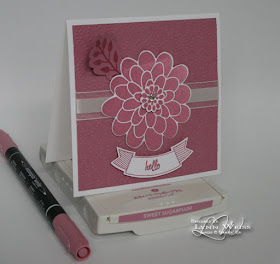
This is the first card I ever made with this gorgeous stamp. More details here.

This one looks like it's going to fly right off the card! See more here.
This card uses the spotlighting technique. See more info along with an alternate version here.

World of Dreams - I absolutely love this set and have used it a lot.

The "thank you" sentiment is from the Big News set. I used that stamp quite often.

I created a trio of cards using the same technique along with Typeset Specialty Paper. You can see the entire set here.

Some of the retiring stamp sets have already sold out...but many retiring products are still available until May 31st (or while supplies last) Shop Now to get your favorites before they are gone!


I hope you enjoyed this Flashback...and the long Memorial Day weekend as well!

Wednesday, May 25, 2016

Flower Shop In Colors

Today is the day that my local stampin' friends stop by to pick up their catalogs and do a few make & takes! I'm looking forward to seeing them and share the excitement of the new catalog!  Here is one of the cards we will be making today. It features each of the new In Colors.


The Flower Shop stamp set with it's coordinating Pansy Punch make such cute and easy cards. It's one of my go to sets...and flowers are a great way to showcase these particular colors as an entire group.

Besides the new In Colors, a new stamp/punch duo was used here...the Thoughtful Banners stamp set paired with the Duet Banner Punch has already become an instant favorite in my stampin' studio...and I just know my stampin' friends are going to love it as well! These items are available as a bundle in the new catalog.

Besides the new catalog, I think these rich, chewy Salted Caramel Bars I made might be the highlight of the party. They are so rich & buttery! Good thing I am having company to share them with or I would be in trouble!

Gotta run and finish getting everything ready for my stampin' friends! If you live near me in Livingston County area of SE Michigan and would like to pick up a catalog, please contact me.

Monday, May 23, 2016

Timeless Textured Butterfly Basics

What a beautiful weekend we had here! I figured we are pretty safe from frost at this point so I got busy and started planting some of my flowers in pots. All the pretty colorful flowers brighten up the yard and make me feel happy...BUT unfortunately there is someone who isn't happy!

A dirty rotten squirrel (or maybe chipmunk?) keeps digging up my planted flowers each night! Yesterday after replanting what I could salvage, I sprinkled cayenne pepper around each plant. This morning I found that most were left untouched, but there was one area that the little vandal went crazy in. I can only hope that he jumped in there busily searching for nuts and instead got a snootful of hot pepper! As he tried to wipe it from his nose and eyes he just spread it around making it worse...because his filthy paws were covered in the red hot pepper! Ahhh...revenge is sweet! Hopefully he gets the message (tells his friends) and moves on ...or this is going to get very costly and even more frustrating.

Here's one pretty flower my nemesis can't mess with...


It's been a while since I used Butterfly Basics and I thought it would be pretty combined with some of the stamps from Timeless Textures. I used Mint Macaron, Perfect Plum and Pool Party to create a soft look perfect for Spring or any occasion. The Venetian Crochet Trim (retiring) tied with Linen Thread along with a Basic Pearl add the finishing touches to the card.

Thanks for visiting. If you have any good suggestions for keeping the squirrels and chipmunks from destroying flowers...please share!

Wednesday, May 18, 2016

Blissfully Sitting Here

In yesterdays post I mentioned being inspired by many beautiful color combos and samples in the upcoming new catalog. I thought it would be fun to pick a new color combo I was drawn to and use it on a card. The color combo I've chosen is featured in the new Designer Series Paper called Blooms & Bliss.

I used Bermuda Bay, Mint Macaron & Sweet Sugarplum...BUT as I started to write this post, I looked up the name of the DSP, and noticed I actually used the wrong color! LOL When creating this card I had just glanced at the swatches for the coordinating cardstock pack and thought it was Bermuda Bay when in actuality the color used in the DSP is Island Indigo. Oh well...I still love the colors together, and that's the point of pairing colors, right!? Pages 138-39 showcase the entire Blooms & Bliss Suite of products...such pretty samples!

I used the Sitting Here stamp set to create my relaxing scene. I watercolored the images using my Aqua Painter. The flower was die cut using the Botanical Builder Framelits and then stamped with burlap texture using the Timeless Textures stamp set. The banner was stamped using the Thoughtful Banners set and then punched using the awesome new Duet Banners Punch.

The other day when I shared my first card using the Sitting Here stamp set, I also shared a photo of Stevie, my kitty cat and "stampin' buddy". I learned that many of you that visit my blog are also cat lovers! A couple of you commented on finding your cats curled up in drawers and other strange places. I thought I'd show you one of Stevies's favorite spots to relax...


I have this planter that at one time had herbs in it. I moved the herbs outside and was going to replace them with some ivy. That's when Stevie adopted the empty planter as his. He wasn't quite a year old in this photo, and not yet fully grown. So as you can see, he fit into the planter with room to spare.


Now that he is fully grown (I think?), he still manages to squeeze himself into the planter! It doesn't really look that comfortable, but he just loves it! I catch him snoozing in there quite often, so I guess it's more comfortable than it looks. It always makes me smile when I see him lounging in the planter.

Tuesday, May 17, 2016

New Catalog Countdown!

Only two more weeks before the new Stampin' Up! catalog goes live! I already have a HUGE wishlist going and the Jar of Love stamp set and the coordinating framelits are at the top of my list! They were used on several of these samples shown below...which are also on the new catalog cover!


Along with the great new sets, I love the pretty color combos used here. The samples used throughout the catalog are really inspiring. Even though I don't have the new products shown above...I DO have the colors! So today I'm going to pick a pretty color combo inspired from the new catalog and use it on a new creation that I'll share here tomorrow.

With all the excitement about the new catalog...don't forget about all the great products that are retiring. When the new catalog finally IS available...those retiring products WON'T be. May 31st is the last day to order retiring product...so get them while you can!

Let me know if you would like a copy of the new catalog.

Monday, May 16, 2016

Peacefully Sitting Here

I was super excited to see a stamp set that was at the very top of my new catalog wish list offered on the pre-order! Sitting Here is a beautiful new set to color featuring not only a pretty kitty but a cute, curled up pup as well! Of course I selected the kitty cat to use on my first creation with this set and colored him a bit like my favorite feline friend Stevie. (who just so happens to be sitting on my lap purring away as I write this post.)


To soften the ropes of the swing and add some interest at the top, I stamped the flowering, leafy image from Awesomely Artistic. This creates such a tranquil scene...I would love to sit on this swing with my kitty and look through the new SU! catalog, wouldn't you?

I used a couple of the new In Colors here...Dapper Denim and Sweet Sugarplum. The new Ruched Ribbon is nice to work with. It's a little stiffer than the Seam Binding Ribbon, which is sadly retiring, but I like the thinner width and more compact bow...which a think will keep it's shape nicer. The added texture is a plus as well.

Here's a photo I took the other day of the aforementioned "favorite feline friend"...as he relaxed in my desk drawer while I did some computer work. He always has to be near by..."helping me". He's such a sweet boy.

I'm happy to see not just the Sitting Here set that contains a cat image, but a whole entire set called Pretty Kitty which I cannot wait to get from the new catalog!

Thanks for visiting today.

Thursday, May 12, 2016

Hello In Colors!

Color me HAPPY...I've got five brand new In Colors to play with! Yes, I was the kid who was happy with a box of 64 crayons and a coloring book vs more expensive toys!  I've been having so much FUN playing with this set of new colors and the Flower Patch stamp set that I created a set of five cards...each one focuses on each of the new In Colors.


I really love the new set Thoughtful Banners and it's coordinating Duet Banner punch! I'm sure I will get a lot of use out of both.  Each background for these 4-1/4" square cards is embossed using the Elegant Dots EF and is embellished with White Organza Ribbon & a Basic Rhinestone.

There is pretty 3/8" Ruched Ribbon that comes in each of the new In Colors, but I only purchased one spool to see how I like it. (LOVE it! So I'm sure the other colors will make their way to my house soon!)


Dapper Denim...So far, I think I like this color the best...maybe because it reminds me of a cross between Not Quite Navy and Midnight Muse? Whatever the reason, it's just a good blue that is a nice contrast with the three more pastel shades included in this new set of colors.


I start to have 80's/90's flashbacks when I see some of these next colors...


Sweet Sugar Plum...my bridesmaids wore a similar color for our wedding in 1985. Check it out..


I even had a couch similar to this color...still can't believe my hubby agreed to that!


Anyways...Sweet Sugarplum is a nice purple-pink color which is much darker, and nicer than the old Mauve Mist  or Pale Plum that SU! used to have when I first started stamping.


Peekaboo Peach is dusty peach color that is really true to the fruit it's named after. Again, I remember wearing lots of clothing in the late 80's that were lighter shades of peach.


The closest color comparisons I can think of are Peach Parfait  which as you can see is darker and Apricot Appeal,which didn't photograph well here, but you can see is much lighter.


Flirty Flamingo reminds me of a nicer shade of Cameo Coral which was a shade when I first started with SU!. I think this is going to look really pretty with Watermelon Wonder and Blushing Bride. This color also makes me think of  the pastel colored t-shirts Don Johnson wore under his white suit on Miami Vice. A quick Google search, and YES! Don Johnson was a Flirty Flamingo fan!

I used to LOVE that show...and of course Sonny Crockett and his partner Ricco Tubbs! I'm sure he wore Peekaboo Peach and Sweet Sugarplum shirts as well!


As you can see with this color comparison, Flirty Flamingo is quite close to Cameo Coral. I think it will work well as a companion to Watermelon Wonder.


Emerald Envy...I look at this color and it takes me back to a favorite pair of tennis shoes I had in the early 90's. They were LA Gear and they were white with Emerald Envy and purple trim. They came with two different colored shoe laces that you could weave together or use one of each!  I thought I was pretty cool in those shoes! LOL I found this image online...maybe not the exact shoes, but same brand & color combo...so see, I wasn't imagining it! They are a pretty close color match don't you think?


Here's how it looks with some previously retired colors...


It's a little more subtle, than Glorious Green with a bit of blue, but obviously not as much blue as Forest Foliage. I think it may play nice with Bermuda Bay or Island Indigo...will have to check that out to see for certain.

Do you have a favorite In Color yet?