Creations by Lynn Weiss ~ Independent Stampin' Up! Demonstrator

ENJOY ~ INSPIRE ~ CREATE ~ SHARE


Showing posts with label New Stuff. Show all posts

Friday, June 22, 2018

Very Vintage Blessing

The new host set Very Vintage has some really pretty images and great sentiments that are perfect for creating collage style cards, so of course I HAD to have this set!


I water colored the beautiful floral image using my Aqua Painter and several new colors...Merry Merlot, Gorgeous Grape & Granny Apple Green, along with Fresh Fig, Powder Pink, Mint Macaron & Tranquil Tide. I really like the way Fresh Fig and Merry Merlot blend together when water coloring. The doily image was stamped in Sahara Sand after I finished water coloring.


Here's a closer look that shows the stitching around the edge created using the Stitched Label Framelits. This set of framelits was also a must have for me because I think they are going to be very versatile. I love the idea that with two different styles of stitched edgelits I can pretty much make any size square or rectangle and get that stitched look along the edge.

Have a GREAT weekend!

Wednesday, June 20, 2018

Accented Blooms Thank You

Thank you SU! for bring Coastal Cabana back! Just love this color, and also this brand new set...Accented Blooms!


I love sets that coordinate with a punches! This one has two different greetings that you can punch out using the Tailored Tag Punch. It is also fun to color! I used my Aqua Painter and inks to color these beautiful blooms, but this would also be a great set to use Stampin' Blend Markers.


I used two brand new colors...Gorgeous Grape on the largest flower and Granny Apple Green for the leaves. It's such a nice fresh green that pairs nicely with Old Olive, which I used for the shading. You may have noticed the beautiful textures on this card...


Most obvious is the Climbing Vine Embossing Folder used on the main panel, but I also used the Subtle Embossing Folder over my watercolored image. I just love the look this EF gives. The ribbon used here also has a nice texture...the little polka dots are soft & fuzzy. It's the new 5/8" Polka Dot Tulle Ribbon.

Monday, January 01, 2018

Party Panda Ringing in the New Year!

HAPPY NEW YEAR! I say it every year, and I'll say it again...WOW, did this year fly by! I started this blog way back on New Year's Day of 2007...so today is my 11 year Blogiversary as well. So lets celebrate the day with the adorable new Sale-A-Bration set Party Pandas!


The panda bears in this set are absolutely darling! Paired with the Picture Perfect Party DSP it really makes for some super cute, festive projects! This DSP will be available in just a few days from the new Occasions Catalog. Both Sale-A-Bration and the Occasions Catalog start on January 3rd.

Wishing you good health, much happiness and lots of creativity in 2018!

Wednesday, June 21, 2017

Feathery Friends Thanks

I must say, there are some really great stamp sets Just For Hosts in the new catalog! I just LOVE the adorable images in the Feathery Friends set...especially the sweet bird I used on this thank you card.


I had fun watercoloring these images and I tried a couple of my favorite new In Colors...Lemon Lime Twist & Berry Burst along with a couple of lasts years In Colors...Peekaboo Peach & Flirty Flamingo.

The textured background was created by inking up the new Pinewood Planks Dynamic Embossing Folder with Crumb Cake ink before rolling it through my Big Shot.


Don't you just love this ribbon? It's the new Crinkled Seam Binding Ribbon in Berry Burst. Another new embellishment used on this card is the Glitter Enamel Dots. They are really super cute and even much prettier in person because they really do sparkle,

Have you checked out the great Just For Hosts section at the back of the new catalog? Now is the perfect time to earn these wonderful new sets with the WE ♥ HOSTS promo going on through June.


Contact me today to schedule your workshop or place your order. Read all the details here.


Tuesday, June 28, 2016

Peachy Jar of Love

Flowers, not peaches, fill this little jar...but I did use Peekaboo Peach along with Flirty Flamingo for this cheery color combo.

The new Jar of Love stamp set is so much fun! It has so many little pieces that you can stamp and then easily die cut using the coordinating Everyday Jar Framelits. I love that these two items are available in a bundle at a 10% savings. Trust me...you will want them both!

In addition to the two new In Colors, Peekaboo Peach & Flirty Flamingo, mentioned above, I have also used Pool Party and Pear Pizzazz to round out my color combo. Pool Party is the perfect color if you want to create the look of a vintage Mason jar.

The cute Delicate White Doilies add another vintage touch to this card. They are a little bit smaller, with a little different pattern than the previous Tea Lace Paper Doilies SU! carried. I think they work well with the Lovely Lace Embossing Folder used on the Flirty Flamingo layer.

Peekaboo Peach Ruched Ribbon and a few Basic Pearls adhered to the center of each flower add the finishing touches to the card.

When working with many die cut pieces like on this card, sometimes it is difficult to re-create the original arrangement when you go to adhere each individual piece into place on your card front. I know I've ran into this problem on numerous occasions. Many times, I would take a quick photo to help me re-create the arrangement I had fiddled around with until I was happy, but that didn't always guarantee it would turn out as I had hoped. Recently, I saw a fantastic trick using Glad Press'n Seal Wrap that will change your life! Well, maybe I'm being a bit dramatic, but this is seriously a GREAT tip!

When you are at the point in your project where you love the arrangement you have created and are ready to adhere it into place, tear off enough Press'n Seal Wrap to cover your project. Place the sticky side down on top of your arrangement and lightly rub over the top of it, as shown below. (don't mind my messy work surface!)
After you have applied light pressure to the die cuts you want to adhere (I was only concerned with the jar and the flower/leaf pieces not the background), you can lift up the wrap and all of the pieces should be stuck in place. Flip over the wrap and now you can easily apply your adhesive of choice to the backside of your die cut pieces all at once instead of each individual piece.
Ooops...as you can see, I made use of the other side of my cardstock to re-stamp the jar because I wasn't happy how I lined up the water image the first time! So just pretend that the backside is just plain Pool Party card stock, OK? ;-)

After I applied Tombo Multipurpose Glue to the back, I flipped the wrap over and carefully hovered over my background piece I had ready, lining up from top to bottom and side to side. The wrap makes this so easy! Once you have your arrangement centered, carefully lower onto background and then press die cuts into place. Allow to let set for a moment for the glue to adhere to your background. Then simply lift up gently on the wrap to remove.

One piece of wrap can be used multiple times, I just stick it inside the front of one of my drawers so it's handy until I need it again. Here is the link to the video where I first saw this tip.

Thursday, June 16, 2016

Blooms, Bliss, Bella & Friends

I've heard some say....the Pretty Kitty set is cute, but I'm a dog lover. I think the adorable images in the Bella & Friends stamp set is sure to please most any animal lover. Both of these sets were at the top of my "must have" list! Here's a card featuring my favorite image...Bella and her turtle friend.


The sweet line art images are so much fun to watercolor! I used my Aqua Painter and colors of ink picked from the Blooms & Bliss DSP...Sahara Sand, Island Indigo and Mint Macaron.

The intricate die cut flower and border is created using the beautiful new Flourish Thinlits. I'm happy to report that they cut beautifully using the Precision Base Plate. All the pieces popped right out with no need for wax paper or dryer sheets. I ran my Die Brush across once or twice and they were perfect. These dies are so pretty...I'm sure I'll be using them lots!

Thanks for visiting!

Tuesday, June 14, 2016

Merry Jar of Love

Yesterday I shared a card using the new Peace This Christmas stamp set. When writing my blog post I thought maybe I'd tag it using the phrase "Merry Monday" and then try and share a new Christmas card here each Monday. Good idea right!? Then I thought, I betcha I'm not the first one who had that idea...and sure enough! after googling the phrase I came upon the Merry Monday Challenge Blog. This week they have a super cute inspiration photo, shown below.


I don't have any tea cup images, but I immediately thought of creating a festive floral arrangement using my brand new Jar of Love & Peace This Christmas stamp sets. So of course I had to play along and this is what I came up with.

I used This Christmas DSP and the new Labeler Alphabet for the word MERRY. I think it turned out pretty cute. Speaking of cute...look what I saw while walking out back this morning. 
Isn't he sweet!? He was all curled up hiding near a pile of brush. I managed to get this photo before he bounded off into the woods.

Friday, June 03, 2016

Sitting Pretty Kitty

I shared about my New Catalog Pick Up Party in my last posting and since it was quite long I decided to share the final make & take in another posting...so here it is!

Big surprise! It uses the Sitting Here stamp set! Of course I couldn't let them get away without stamping this sweet kitty and pot of flowers, right? We then water-colored using some of the new In Colors and an Aqua Painter. Tip: If you have a group of people watercoloring with the same colors, easily create several palettes that can be shared by simply scribbling with markers onto a clear imaging sheet from your Stamp-a-Ma-Jig...or use your ink refills in the same manner.

Colors used are: Peekaboo Peach, Flirty Flamingo & Dapper Denim. The sentiment and frame is from the Thoughtful Banners stamp set. I am so mad at myself...I placed my new catalog order first thing on Wednesday morning and I totally forgot to put the new Classic Label punch on my order! It isn't all that difficult to hand cut, as I did here, but I love the quick & easy factor of a punch. I'm sure there will be another order for me in the near future...

Have a great weekend!

Wednesday, June 01, 2016

Find Your Inspiration

Happy New Catalog Day! It's June 1st and the awesome new and inspiring Stampin' Up! catalog is now live! Last week I had a "New Catalog Pick Up Party" where my local stampin' friends had the opportunity to stop by and pick up the new catalog and do some make & takes.

Everyone who attended received the above goodies created using the new In Colors. One make & take used all the new In Colors and the Thoughtful Banners & Flower Shop stamp sets. More info is here. The other make & take was created using the Sitting Here stamp set and I'll share more on that in my next blog posting.
This years In Color bookmark uses the Bitty Butterfly Punch and the Work of Art and Butterfly Basics stamp sets.
The bookmarks have magnets to keep them in place...I like to keep mine at the beginning of the Color Collection pages because I am always flipping to those pages the most.
To help mark favorite items in the catalog I made these post-it flag covers using the Thoughtful Banners set. The words Inspiring, Amazing & Fabulous describe so many of the new products found inside the pages if the new catalog!
I packaged up the bookmarks and post-it flags along with a 1/2 sheet each of the new In Color cardstock in a Large Cello Bag with toppers stamped using the Timelesss Textures stamp set.
No party is complete without treats and prizes! I made these Ghirardelli square covers using Flower Shop and Thoughtful Banners in the five new In Colors. I invited each of my guests to chose one in their favorite color. After everyone had picked one I brought out my prize basket. Each item in the basket had a butterfly punched out from the five different In Colors. Each person could choose from the items marked with the color they choose. Here's my friend Amy looking super excited about her prize and make & takes.
Here are some of the rest of the ladies at my first session. (sorry I did not get pictures of everyone)
I tried a new recipe I found on Pinterest for these Salted Caramel Buttery Crumb Bars. Oh my!...they were rich, ooey gooey buttery caramely goodness!
It was so great to see everyone and share the new catalog excitement with you all!  If you were not able to make it my event but would like a copy of the new catalog, please contact me and I'll make sure to get one to you.

Enjoy finding your inspiration as you flip through the new catalog!

Wednesday, May 18, 2016

Blissfully Sitting Here

In yesterdays post I mentioned being inspired by many beautiful color combos and samples in the upcoming new catalog. I thought it would be fun to pick a new color combo I was drawn to and use it on a card. The color combo I've chosen is featured in the new Designer Series Paper called Blooms & Bliss.


I used Bermuda Bay, Mint Macaron & Sweet Sugarplum...BUT as I started to write this post, I looked up the name of the DSP, and noticed I actually used the wrong color! LOL When creating this card I had just glanced at the swatches for the coordinating cardstock pack and thought it was Bermuda Bay when in actuality the color used in the DSP is Island Indigo. Oh well...I still love the colors together, and that's the point of pairing colors, right!? Pages 138-39 showcase the entire Blooms & Bliss Suite of products...such pretty samples!
I used the Sitting Here stamp set to create my relaxing scene. I watercolored the images using my Aqua Painter. The flower was die cut using the Botanical Builder Framelits and then stamped with burlap texture using the Timeless Textures stamp set. The banner was stamped using the Thoughtful Banners set and then punched using the awesome new Duet Banners Punch.

The other day when I shared my first card using the Sitting Here stamp set, I also shared a photo of Stevie, my kitty cat and "stampin' buddy". I learned that many of you that visit my blog are also cat lovers! A couple of you commented on finding your cats curled up in drawers and other strange places. I thought I'd show you one of Stevies's favorite spots to relax...


I have this planter that at one time had herbs in it. I moved the herbs outside and was going to replace them with some ivy. That's when Stevie adopted the empty planter as his. He wasn't quite a year old in this photo, and not yet fully grown. So as you can see, he fit into the planter with room to spare.


Now that he is fully grown (I think?), he still manages to squeeze himself into the planter! It doesn't really look that comfortable, but he just loves it! I catch him snoozing in there quite often, so I guess it's more comfortable than it looks. It always makes me smile when I see him lounging in the planter.

Tuesday, May 17, 2016

New Catalog Countdown!

Only two more weeks before the new Stampin' Up! catalog goes live! I already have a HUGE wishlist going and the Jar of Love stamp set and the coordinating framelits are at the top of my list! They were used on several of these samples shown below...which are also on the new catalog cover!


Along with the great new sets, I love the pretty color combos used here. The samples used throughout the catalog are really inspiring. Even though I don't have the new products shown above...I DO have the colors! So today I'm going to pick a pretty color combo inspired from the new catalog and use it on a new creation that I'll share here tomorrow.

With all the excitement about the new catalog...don't forget about all the great products that are retiring. When the new catalog finally IS available...those retiring products WON'T be. May 31st is the last day to order retiring product...so get them while you can!

Let me know if you would like a copy of the new catalog.

Monday, May 16, 2016

Peacefully Sitting Here

I was super excited to see a stamp set that was at the very top of my new catalog wish list offered on the pre-order! Sitting Here is a beautiful new set to color featuring not only a pretty kitty but a cute, curled up pup as well! Of course I selected the kitty cat to use on my first creation with this set and colored him a bit like my favorite feline friend Stevie. (who just so happens to be sitting on my lap purring away as I write this post.)


To soften the ropes of the swing and add some interest at the top, I stamped the flowering, leafy image from Awesomely Artistic. This creates such a tranquil scene...I would love to sit on this swing with my kitty and look through the new SU! catalog, wouldn't you?

I used a couple of the new In Colors here...Dapper Denim and Sweet Sugarplum. The new Ruched Ribbon is nice to work with. It's a little stiffer than the Seam Binding Ribbon, which is sadly retiring, but I like the thinner width and more compact bow...which a think will keep it's shape nicer. The added texture is a plus as well.

Here's a photo I took the other day of the aforementioned "favorite feline friend"...as he relaxed in my desk drawer while I did some computer work. He always has to be near by..."helping me". He's such a sweet boy.

I'm happy to see not just the Sitting Here set that contains a cat image, but a whole entire set called Pretty Kitty which I cannot wait to get from the new catalog!

Thanks for visiting today.

Thursday, May 12, 2016

Hello In Colors!

Color me HAPPY...I've got five brand new In Colors to play with! Yes, I was the kid who was happy with a box of 64 crayons and a coloring book vs more expensive toys!  I've been having so much FUN playing with this set of new colors and the Flower Patch stamp set that I created a set of five cards...each one focuses on each of the new In Colors.


I really love the new set Thoughtful Banners and it's coordinating Duet Banner punch! I'm sure I will get a lot of use out of both.  Each background for these 4-1/4" square cards is embossed using the Elegant Dots EF and is embellished with White Organza Ribbon & a Basic Rhinestone.

There is pretty 3/8" Ruched Ribbon that comes in each of the new In Colors, but I only purchased one spool to see how I like it. (LOVE it! So I'm sure the other colors will make their way to my house soon!)


Dapper Denim...So far, I think I like this color the best...maybe because it reminds me of a cross between Not Quite Navy and Midnight Muse? Whatever the reason, it's just a good blue that is a nice contrast with the three more pastel shades included in this new set of colors.


I start to have 80's/90's flashbacks when I see some of these next colors...


Sweet Sugar Plum...my bridesmaids wore a similar color for our wedding in 1985. Check it out..


I even had a couch similar to this color...still can't believe my hubby agreed to that!


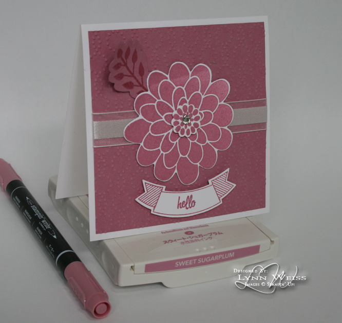
Anyways...Sweet Sugarplum is a nice purple-pink color which is much darker, and nicer than the old Mauve Mist  or Pale Plum that SU! used to have when I first started stamping.


Peekaboo Peach is dusty peach color that is really true to the fruit it's named after. Again, I remember wearing lots of clothing in the late 80's that were lighter shades of peach.


The closest color comparisons I can think of are Peach Parfait  which as you can see is darker and Apricot Appeal,which didn't photograph well here, but you can see is much lighter.


Flirty Flamingo reminds me of a nicer shade of Cameo Coral which was a shade when I first started with SU!. I think this is going to look really pretty with Watermelon Wonder and Blushing Bride. This color also makes me think of  the pastel colored t-shirts Don Johnson wore under his white suit on Miami Vice. A quick Google search, and YES! Don Johnson was a Flirty Flamingo fan!

I used to LOVE that show...and of course Sonny Crockett and his partner Ricco Tubbs! I'm sure he wore Peekaboo Peach and Sweet Sugarplum shirts as well!


As you can see with this color comparison, Flirty Flamingo is quite close to Cameo Coral. I think it will work well as a companion to Watermelon Wonder.


Emerald Envy...I look at this color and it takes me back to a favorite pair of tennis shoes I had in the early 90's. They were LA Gear and they were white with Emerald Envy and purple trim. They came with two different colored shoe laces that you could weave together or use one of each!  I thought I was pretty cool in those shoes! LOL I found this image online...maybe not the exact shoes, but same brand & color combo...so see, I wasn't imagining it! They are a pretty close color match don't you think?


Here's how it looks with some previously retired colors...


It's a little more subtle, than Glorious Green with a bit of blue, but obviously not as much blue as Forest Foliage. I think it may play nice with Bermuda Bay or Island Indigo...will have to check that out to see for certain.

Do you have a favorite In Color yet?