Creations by Lynn Weiss ~ Independent Stampin' Up! Demonstrator

ENJOY ~ INSPIRE ~ CREATE ~ SHARE


Saturday, June 30, 2012

Snow Much Fun Artisan Entry

Here is the first of my two 3-D projects I had to submit for the Artisan Award Contest.

I ended up working on both of my 3-D projects last because I just couldn't decide what to make. I created a Halloween luminary a while back that was completely my design using chipboard coasters, so I thought I'd create another version for Chrismas using the Snow Much Fun set. Here's a closer look.

The coasters are covered in Shimmery White card stock, so along with all the rhinestones, silver embossing and Brushed Silver card stock this had a lot of sparkle & shine. I embossed and stamped a small design all the way around too...

Here's what it looked like lit by the battery operated candle.

I thought it turned out cute, but I knew going in that the 3-D catagory was going to be my weakest, since I don't sew. Some of the other non-winning entries I've seen so far are spectacular...makes me wonder what the winning entries looked like?

With the heat we've been experiencing around the country this week, I'll bet this snowman probably looks really good! Have a great weekend!

Thursday, June 28, 2012

French Foliage Faux Tile

Here's another Artisan Award entry. I tried to show a lot of variety in the work I sent in. This one uses a fun technique and is very masculine.


After I stamped this I embossed it in Clear embossing powder so it really did look like tile. Check out this close up view.
Here's what I used:

Stamps: French Foliage, Happiest Birthday Wishes

Card stock: Wild Wasabi, Garden Green, Early Espresso, Very Vanilla & Well Worn DSP

Ink: Wild Wasabi, Garden Green, Early Espresso, Crumb Cake & Versa Mark

Tools & Accessories: Simply Scored with Diagonal Plate, Clear Embossing Powder, Heat Tool, Mat Pack, Paper Piercing Tool, Early Espresso Marker, Regals Buttons, Linen Thread, Large Oval Punch, Decorative Label Punch & Sponge Daubers

Thanks for all the encouraging comments many have been leaving me regarding my entries. I really appreciate your kind words.

Monday, June 25, 2012

Elegant Elements of Style

Yesterday I shared my first project, a scrapbook page, that I had submitted for this years Artisan Award Contest. Sadly, I did not make the finalist list so that is why I am able to share all 10 of my projects with you here over the next two weeks. Today I'd like to share one of my favorite cards that I created for the contest.  

Since I love to water color and I feel confident with my watercoloring skills I thought this was a good choice. I used many favorites here...such as my choice of stamp sets & colors...I'm sure anyone who visits me regularly has noticed I LOVE purple! Maybe that's where I went wrong? Seems Stampin' Up!'s love affair with purple took a huge hit with the last color renovation, and I sure didn't pay attention to that huge detail when I designed this one! lol
I did pay attention to lots of other details tho...check out that paper piercing! It was all done without the ease of using the awesome new paper piercing templates too! You'd think all that old school piercing alone would score me points and impress the judges!

Stamps: Elements of Style & Teeny Tiny Tags
Card stock: Elegant Eggplant, Wisteria Wonder & Whisper White
Ink: Elegant Eggplant, Wisteria Wonder, Black Stazon, Whisper White Craft & various other Classic Inks for water coloring
Tools & Accessories: Big Shot, Labels Framelits, Adorning Accents Edgelits, Adorning Accents Embossing Folder, Mat Pack, Paper Piercing Tool, Sponge Daubers, Jewelry Tag Punch, Basic Pearls, White Organza Ribbon, White Bakers Twine, Regals Button & Aqua Painter

Thanks for visiting today...stop by again soon to see my other (un)winning Artisan Award projects!

Sunday, June 24, 2012

(Non) Winning Artisan Entry 1

Well, here I am finally uncurled from the fetal position I've been in since I found out I didn't make the finalist list for the Artisan Award! OK...I'm exaggerating, but I must admit it was quite a let down after all the hard work I put into my entries...agonizing over every detail and then the excitement of waiting and hoping. Oh well...at least I tried, right?

This is the first year I have entered, because in previous years I was afraid to set myself up for failure. My family encouraged me to enter and I am really proud of myself for making the commitment and taking the chance. They say there's always at least one positive in any situation and in this one it's that at least I can share my projects with you now...so here goes...

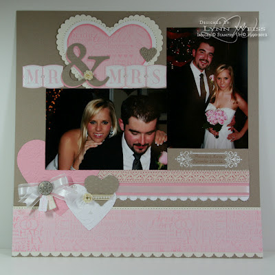
I guess I'll start by sharing this scrapbook page. It was this page that initially made me consider entering the Artisan Award contest to begin with.

I just loved the way this page (which originally was part of a two page layout) turned out...so I decided to duplicate it for the scrapbook portion of the contest. Note to self: If you enter again next year, leave time (ha ha!) to make duplicate pages of all the layouts before sending them off. At least I wouldn't feel so empty handed right now. However, I do have the photos as inspiration to hopefully "some day" re-create them. Here's what the original 2 page layout looked like.

For my entry I decided to take out the die cut doily (maybe that's why I didn't win??? LOL) and I had to add some journaling for it to qualify so I raised the photo and added the names of the bride & groom along with their wedding date. (looking back, I do like my original page without the journaling better...maybe that's why I didn't win???) Can you sense a theme here...I'm picking apart my work even more so than normal looking for the weakest link...oh, well. Thanks to my beautiful niece and her handsome husband for being the inspiration for these pages. She was so excited that I was using photos of them for one of my entries.

Here's what I used to create this layout:

Stamps: Wedding Words Jumbo Wheel, Creative Elements, Tiny Tags & Letter It

Card stock: 12x12 Crumb Cake, 12 x 12 Very Vanilla, 12x12 Pink Pirouette Textured, Pink Pirouette Smooth, Whisper White, Pretty in Pink

Ink: VersaMark, Pretty in Pink

Tools & Accessories: Big Shot, Serif Essentials Alphabet Bigz Die, Hearts Framelits, Adorning Accents Edgelits, Adorning Accents Embossing Folder, Stripes Embossing Folder, Vintage Wallpaper Embossing Folder, Elegant Lines Embossing Folder, White Embossing Powder, Heat Tool, Mat Pack, Paper Piercing Tool, Sponge Daubers, Tiny Tag Punch, Boho Blossom Punch, Antique Brads, Victoria Crochet Trim, White Organza Ribbon, Very Vanilla Grosgrain Ribbon, White Baker’s Twine & Basic Pearls

I'll be posting the remainder of my projects over the next two weeks. I hope you like what you see, and if so I'd love to hear what elements caught your eye.

Friday, June 22, 2012

The Sky's the Limit Graduate!

Here's a card that I made for a graduate using her school colors. Well kinda the school colors...I took a little artistic licence by using Gumball Green & Daffodil Delight, which are a little more subdued than the actual colors. I really love how it turned out!


The large scallops created using the Large Scallop Edgelit & Delicate Designs Embossing Folder make really cute hills for my balloon scene. After creating my sky background using Bashful Blue card stock and the Cupcake Punch (for the clouds) I ran it through the Big Shot using the Snow Burst EF.

This weekend  the town I live in is holding their Annual Balloon Fest. I woke this morning by the sound of hot air balloons coming over our yard. I ran out in my pjs to snap a few quick photos before they disappeared over the tree tops. I love to see the bright, colorful balloons up in the sky...guess that's why Up, Up and Away is one of my favorite stamp sets!


Have a wonderful weekend!

Tuesday, June 19, 2012

Floral District Butterfly Birthday

A couple of the must have items on my first new catalog order were definitely the Papillon Potpourri set and the coordinating Elegant Butterfly Punch! Here is the first card I created with them.


I picked up my color scheme from the super cute Floral District DSP...Baja Breeze, Rich Razzleberry, Tangerine Tango & Rose Red. I used my favorite new tool here as well...the Essentials Paper Piercing Template. It sure makes piercing around shapes a breeze! It adds nice detail to the Apothecary Accent Framelit and the scalloped edge created with the Large Scallop Edgelit. Speaking of nice detail...don't you just love the pretty detail of the Delicate Designs Embossing Folder? That's another one of my favorites for sure! The birthday sentiment is from the Blue Ribbon stamp set...quickly becoming yet another new favorite!

We will be using all of these supplies and more at my New Catalog Kick Off Party going on in my home next week - Wednesday, June 27th. If you are local, I would love for you to come! Just contact me via email (on my sidebar) and I'll give you more details.

Have a beautiful day! It's a HOT one here...the pool is looking awful tempting!

Sunday, June 17, 2012

Blue Ribbon Dad

Happy Father's Day! Here is the card I made for my hubby using the new Blue Ribbon stamp set.


I'm not sure why my Not Quite Navy ink photographed so much different from the card stock? In real life it's a way closer match.

Anyways...I love the little congrats ribbon image that comes with this set, so I thought why not make my own ribbons by using My Digital Studio? All I did was use different fonts in different sizes using Not Quite Navy ink. Then I printed out the "ribbon" strip and cut them into the banner shapes using my Square Punch for the ends. ( I don't have the Bitty Banner Framelits yet) I sponged the edges of each banner with...you guessed it...Not Quite Navy ink!

I also used the new Chevron Embossing Folder and some Silver Glimmer Paper for some sparkle.

Hope you get to enjoy the day with those special Dad's in your life!

Friday, June 15, 2012

Dad's Summer Afternoon

One of my very favorite sets in the new catalog is the Hostess set Summer Afternoon. I love all three of the beautiful line drawn images...especially this one of the flower cart and the cute little dog.


My Dad loves gardening, so I thought why not use this image for his Father's Day card? This image alone wouldn't necessarily appear masculine, but by using patterns & colors from the Well Worn pack of DSP (retired) I think this is the perfect manly card for my Dad.

Since I had to mail this card and didn't want it too bulky, instead of using a button from my stash, I created a thinner button using Not Quite Navy card stock cut with the Button Sizzlet. To give it some shine and added dimension I embossed it with Clear Embossing Powder.

Have a wonderful weekend...and HAPPY Father's Day to all the great Dad's out there!

Wednesday, June 13, 2012

Workspace Wednesday - Organizing Framelits

I just love the new Framelits that Stampin' Up! has came out with recently! I think it's great that they even included a plastic storage envelope with the name of the set right on them for easy organization. What I didn't like was the strip of tape attached to the inner cardboard piece that held the Framelits in place. It was hard to get them off the tape and I was always worried I would bend one...so here's what I did to make them even easier to use.

First, hang on to the cardboard sheet with the strip of tape on it, this will be the backing & template for size. Next, cut a magnetic sheet & a piece of DSP to the same size of the cardboard piece.
Note: for smaller dies like the Edgelits, you can get away with using just a strip of the magnetic sheet.

Next, just adhere the magnetic sheet to the cardboard backing and then cover the magnetic sheet with a pretty piece of Designer Paper. (Tombo Multipurpose Adhesive is what I used)
Now it's easy to grab just the right sized die and put away when done. I also keep the instruction sheet in the envelope for easy reference if needed. I did all my Framelits & Edgelits but plan to do the same with my Nesties. Sizzix sells plastic envelopes in a set of three with a cute scalloped  flap. (around $5- $6 for the pack) The flap on these are one the side, but otherwise they are the same. Hopefully some day SU! will sell just the envelopes.
For now I have them on my Big Shot cutting station stored in this cute cardboard bin I picked up a while back in the Target Dollar Spot. It's kind of small...I'm sure I'll be outgrowing it soon...especially after getting a peek of the upcoming Holiday Catalog!
I just added a bow and a brad to the front to dress it up and now even my Framelits coordinate with my room! I'm not sure where I originally saw the idea to add the magnetic sheet for easy storage, but I thought it was a great idea...and I hope you do as well!

Monday, June 11, 2012

Two By Two For Wyatt

This past weekend my niece gave birth to her first child...a boy! He is healthy and just beautiful! Of course I had to make a card for the occasion, so it was the perfect excuse to play with some of my new goodies from the new catalog!


I think Two By Two is one of the cutest stamps in the new catalog, and since I knew my niece was due with a baby boy very soon, I had to get it, right!? I also used a couple other new favorites here...the Apothecary Accents Framelits, Chevron Embossing Folder and the Essentials Paper-Piercing Pack. I love to add detail to my creations with paper piercing, so I was super excited to get my hands on these new templates...and the new larger Stampin' Pierce Mat as well. Check it out...
See how easy it is to add some piercing around the edge of the Apothecary Accent Label? This larger size also enables you to easily go across the card front without having to move the template as you go. This is my favorite new tool!

Stamps: Two By Two & Tiny Tags
Card stock: Baja Breeze, Midnight Muse, Raspberry Ripple & Whisper White
Ink: Black Stazon, Midnight Muse, Raspberry Ripple & various other Classic Ink to watercolor
Accessories: Labels Collection Framelits, Apothecary Accent Framelits, Chevron Embossing Folder and the Essentials Paper-Piercing Pack, Stampin' Pierce Mat, Aqua Painter, Raspberry Ripple Stitched Satin Ribbon, Jewelry Tag Punch & More Mustard Brads

What are your favorite new items from the new catalog?

Edited to add: I've had lots of questions regarding the narrow mat behind the stamped image on this card and others. Here is how I do it: Using the same framelit that I cut the white, stamped layer, I traced around the outside of it with a pencil onto Baja Breeze cardstock and then cut it out by hand. Since the framelits cut on the inside edge, tracing around the outside edge will give you a mat that is approx 1/4" all the way around. After cutting, if it's not perfect in some spots adding a little distressing helps. ;-)